Caption Styles for Shorts: How to Choose One That Reads
Captions are the first thing a muted viewer reads, so their style decides whether the clip gets a chance. There is no single best look — but there are a few families, each right for a different kind of video. Here's how to choose.
Readability comes first
Before colour or motion, check three things on a phone screen: the text is large enough to read at arm's length, it separates from the picture behind it (an outline, a shadow or a backdrop), and a line holds only a few words. Three to five words per line is the comfortable range for vertical video.
Keep captions out of the bottom strip where the platform puts its own buttons and description, and away from the speaker's face. If the default position covers something important, move the captions rather than shrinking them.
Highlight the spoken word — for talking heads
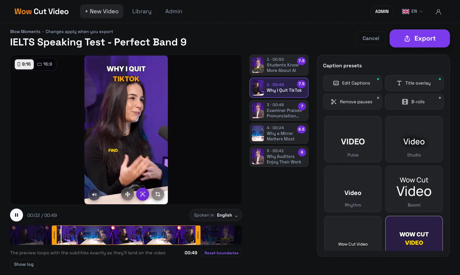
When one person talks to camera, marking the word being said keeps the eye moving with the voice. A colour change (Pulse, Promo) is the classic short-form look; a rounded plate behind the word (Marker) is louder and works well for energetic speakers.
Calm lines — for interviews, tutorials and brands
Not every video should shout. Plain white text in natural case (Clean, Studio) or words fading in as they're spoken (Rhythm) suits interviews, explainers and brand content, where the captions should help without becoming the show.
Big statements — for quotes and punchlines
For a strong line you want people to screenshot, use a style built for emphasis: one big word at a time (Impact), large rows where the stress moves to the key phrase (Statement, Boom!), or headline-style compositions (Dynamic). Use them for short, punchy clips; over a long explanation they tire the eye.
A backdrop — for busy or bright footage
If the background is bright, patterned or changes fast, white letters disappear. A translucent dark slab behind the text (Story) or a solid light plate (Label) keeps captions readable on any shot, at the cost of covering a bit more of the picture.
Try styles on your own frame
The only real test is your footage. In Wow Cut Video the presets play on your clip in the review screen, so you compare them on the real frame before rendering. Then adjust the font, colours, highlight, number of rows, letter case or position, and save the result as your own style to reuse it on the next video.